Blog Post 5- Single Page Website

Top Notch Single Page Site

After reviewing the links provided that gave examples of single page websites, I found myself favoring one in particular because the overall experience during my time on the page was enjoyable. The page that I though utilized a single page web design the best was the Every Last Drop website. After reading about the concept behind single page websites and how they are beneficial I felt that one of the main factors was that they hold the users attention. The designer must do this by creating an interesting layout, and presenting information clearly. Because the website is only a single page the content that is provided should be completely necessary, the “less is more” idea.

As I visited this page I didn’t find myself searching for anything, I just had to scroll down and enjoy the ride as all of the information was presented to me with an entertaining animation.  The navigation arrow on the bottom right was also a nice hint for users to understand that they needed to start scrolling to navigate through the content.

every-last-drop-home

Every Last Drop Home Page

The style of the webpage, and color scheme fits well with the concept that the site is presenting. While, the layout changed as the user scrolls, the consistent style/colors allowed for transitions to feel like they were a continuation of the last page, rather than looking like the pages didn’t work well together in a visual sense. The transitions between the changing layouts were smooth, and seemed very natural. Also, the fact that the designer included multiple media sources was a nice surprise at the bottom of the page, and to continue with the pleasant surprises the designer presented an alternate option to play the video that was very clever and enhanced the experience even more. Over all the experience was very enjoyable, and left an impact on me as I continued to explore other single paged websites.

every-last-drop-bottom

Example of unique way to present information

The Slacker

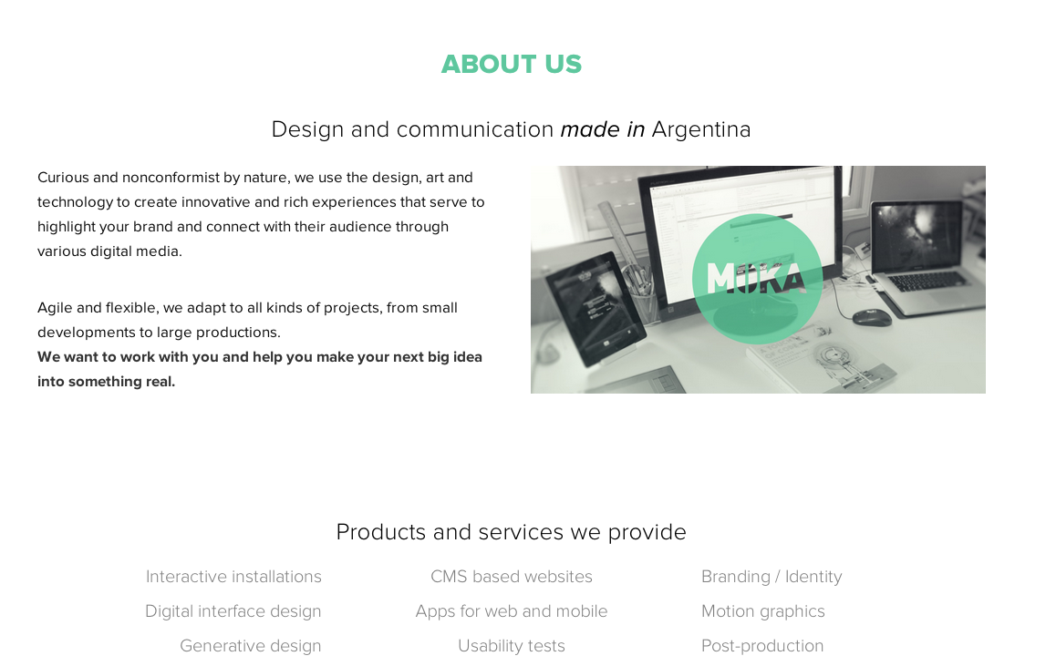
Out of the pages that I visited, the one that I thought utilized the single page concept to the least of its capability was the Moka site. While it is usable, the overall experience was definitely nothing to write home about.

The whole idea behind single page sites is to cater to the users short attention span and this site was nothing more than boring for me to look at. The layout was not interesting, and it doesn’t appear to have much thought process behind the design. It looks like the designer centered all the content and threw in a splash of color in there and called it a day. This website is not engaging for the user which I find disappointing especially since the page is promoting design. As the user scrolls down the page and is presented with new information, the information should be presented in away that is speaks to the content, it should not remain consistent through all sections as it does in this example. As a result, the visuals of this website seem very generic in this design, and don’t feel personalized for the company.

Moka-home

Moka-about

Moka-comments

Boring transitions to different sections


Critique of Zac Brown Band Website

After being assigned exercise 4 I decided that I wanted to do a one-page web design for Zac Brown band, which is one of my favorite groups to listen to. Open first visiting their website, I was immediately drawn into a carousel of call to actions. For a first time visitor this is very important, as it is what will prompt the user to click, and ultimately explore the website further.

While the home page includes a large amount of graphics, it organizes them well, and allows the user to navigate through them with ease. As I went through each of the interior pages I found that they all had a similar layout that consisted of a horizontal image/carousel across the top of the page with 2 columns bellow that image that held the necessary content for that page. This only differed on the Gallery/video pages where a multi column layout was used to house the vast amount of pictures. Because this use of a similar grid system it allowed for an easier transition from page to page without confusing me.

zbb-home-page

Example of the home page

The designer of this website has set a clear hierarchy in the navigation by placing it horizontally at the very top of the page, this makes navigation through the large amount of content a little more bearable.

zbb-nav

Example of navigation bar

One of the things that really stood out to me as I explored this webpage was that each page gave hierarchy to elements that corresponded well with that page. For example on the Shows page, in one column they have upcoming shows that include interesting graphic elements that the target audience can relate to (the ticket stubs), and then in the other column there are calls to action that talk about making this night a lot more than just a concert. The designer included Eat and Greets with the band, how to get tickets, and even beer advertisements, all of which will provide an all around better experience for the user. A critique that I do have about the navigation for the designer is that they could have considered putting navigation at the bottom of the page so that the reader doesn’t have to scroll back up to the top of the page to continue exploring the site.

zbb-events-page

Creating the full experience

From a presentation point of view, I found that the designer did a nice job of making the pages look like they had some depth by using textures, instead of just flat color boxes. They also used a consistent color scheme throughout the pages that helped to tie the website together as a whole. The warm/ earth tone color scheme also seems appropriate for the content since this is a country music band, and that usually brings to mind nature, mud, barns, and so on.

zbb-textures

Example of Textures on page

On the topic of typography, there doesn’t seem to be a clear hierarchy in the body content, the headings and subheads are very similar in size and weight and it feels like my eyes are struggling to figure out what I should look at first, and with website design the user should never have to “figure something out,” because that will ultimately lower the chances of the user having a positive experience and will put them back at the search results page, looking for something better.

zbb-hierarchy-issues

Example of hierarchy issues between headings and sub-heads

On the other hand, the colors of the type do contrast well with the background color, which allows for good readability. The content is broken up into small sections with headings and subheadings above each section to allow for scan ability, but as I mentioned above they need more hierarchy.

The designer made hyper links easy to identify throughout the pages by emphasizing them with a different color, and including a hoover state, which informs the user that they can click on that link.

zzb-link-example

Example of Links

While the Zac Brown Band website is pretty well organized and functional as is, I think that they could benefit from a single paged web design by not overwhelming the user as much with such a vast amount of pages and or content. A single page website is much easier for the user to navigate through, and can highlight only the most important information.  In the case of a single page website, the site can be designed for quality rather than quantity.

Blog post 4- Visual Research

Topic and Visual Research

Authors Website: Sarah Dessen

Sarah Dessens website includes information about the books she has written, different places they can be ordered, a blog that she runs, ways to get connected with her and so on. Upon first entering the site you are presented with a main navigation bar that sits horizontally at the top of the page, the navigation bar categorizes different areas that a viewer would be looking for when searching this author, these areas include her books, her biography, reviews from critics, her blog, and her latest news/ when she will be making appearances.

Image

These interior pages of the site appear to be organized into a multicolumn grid system. The main content for that category is in a column to the left of the page, and then there is a second column to the right that contains information about Sarah Dessens recent blog posts, a short about section, and ways to connect with her via social media. The most important element on the home page in my opinion is the books category of the navigation bar. I believe this is the most important aspect of the page because after all that is how she is making a living, by selling her books.

ImageImage

Critique of design

After studying the site for a while I came to the conclusion that it is pretty simple to navigate and doesn’t leave the user digging through an excessive amount of content to find what it is they are looking for. The design seems very minimal with a basic color pallet that is repeated throughout the site, and quite a bit of negative space. The content is well organized for web-based purposes, it is broken up into small sections with subheadings that are set in a san serif typeface of a different color, this compliments the serif body copy nicely.

Image

In my opinion the homepage could include a call to action to get viewers intrigued and more likely to purchase one of the Sarah’s books. The aesthetic of the design seems to fit the target audience well, which is young adult readers, with her books mainly being geared towards girls.

Other Youth Fiction Authors

 Suzanne Collins

I searched for author author’s that wrote in the same genre as Sarah Dessen and Found Suzanne Collins, the author of the popular novel the Hunger Games. After visiting her website I saw room for a lot of improvement. The design of her page left me very disappointed. Her home page doesn’t show any sign of a consistent grid system, and there is no clear hierarchy of content on the page.

Image

Image

The side bar on the home page (to the right side of the page) could use improvement as well, there isn’t any space between different sections, which gives it a very cluttered feel and makes it difficult to read. It is hard to tell what element on the homepage is meant to be the most important because it seems like every element on the page is a similar size and place sporadically throughout the page, everything is competing for the viewers attention.

Image

While studying her navigation bar I visited the three categories, which included, her works or books that she has written, a biography about her, and an interview.  The page that includes the books that she has written needs work in my opinion as well. Although the content on this page is organized in small sections, as it should be, the line lengths appear way too long and causes difficulty when the user is trying to read it, it also steers the reader away from reading it in general. The content should look inviting and draw the reader in.

Image

I would also like to critique the imagery of her book covers that are shown vertically down the left hand side of the page, there alignment should remain consistent in my opinion and the size/cropping could use some tidying up as well.  It would also be to the authors benefit if she included a link to a website in which they could order the book immediately after reading it’s summary.

Image

The type choice and color scheme could also be spiced up in my opinion to compliment the books she is writing, or appeal to her target audience. Overall, I fell that this page is very poorly designed, and it could use quite the make over. The page is usable and easy to navigate but it is unappealing to the eye, and doesn’t draw the user in, as it should.

John Green

After just spending time studying Suzanne Collins webpage, I was relieved when I opened John Green’s website and saw a grid system being used and a clear hierarchy beginning on the home page. John Green is another Youth fiction author that is known for writing The Fault In Our Stars, Looking for Alaska, and other popular novels. Upon first visiting his site I was very intrigued with the unique type choice that was being used, and the equally unique navigation set up at the top of the page. Both of these elements strayed away from the norm and aided in interesting the user.

Image

One of the other elements that caught my eye immediately was the side bar to the left of the page that had a vertical list of the books he has written, I thought it was a nice touch that there were small illustrations included next to the book name, I also like that when I hovered my mouse over the illustration to click the link, the illustration became colored. This gave the user a visual variation to let them know that they could click on this link.

Image

A small complaint that I have about his book section is that he doesn’t include a link on where to purchase the books.  The fact that these the Authors name, and the list of books that he has written hold the most hierarchy on the page allow you to see that these are the most important elements on the homepage, as they should be since that is what most of the users visiting this page are looking for.

On a few of his book pages there is an image included that is floated to the right with the text flowing accordingly around it, this adds a nice edge to the page, rather than the usual picture aligned all the way to the left with a column of text next to it like you usually see. I do wish that there were a little more space between the image and text though; it is causing a little bit of uncomfortable tension on the page. I looked at this image in firebug and it seems that it has no top or bottom margin applied it.

ImageImage

I also noticed that out of the three authors websites that I visited, this was the only one that included alternate media sources, such as videos on it. I thought that this could only benefit the author, allowing him to connect on a different, more personal level with his readers.

Image

Publisher

The publisher of Sarah Dessens book, Dreamland is Speak, which was launched by Puffin books (Branch of Penguin Publishing), a paperback publisher of children’s books. This website differs from an individual authors website by its navigation and content, because unlike the individual author this is a large company that requires a larger amount of navigation through a larger amount of content. It is similar to the authors’ websites in that the structure is similar; it follows a multi column grid system that aids in organizing content. Similarly it also includes sidebars and navigation that link the user to a variety of pages depending on what they are searching for. It also repeats a simple color scheme throughout its pages; this helps the pages to look like a cohesive whole.

Image

It was interesting to see that the side bar on the speak home page had a drop down menu that appeared as you hovered the mouse over it, I’ve only really seen this occur at the top of the page, with a horizontal navigation bar. The horizontal navigation bar included visual cues as well that informed the user that they could click on that category.

Image

The most important element on the Speak home page appears to be the Penguin Publishing company because it holds the most visual hierarchy on the page, Speak is what draws my attention next, and then there are a few short paragraphs elaboration on what Speak is, and when it was launched.

Visual Inspiration

Image

I am inspired by the color blocking on this page, I find that it gives the page an interesting look as the user scrolls down it, and it allows for a unique way to break up information. This can add visual interest to my design, and make my site stand out from others.

Image

I found the banner along the top of  this web page to be a unique design solution for the web page name, and heading. I am inspired by the layered look that the designer created by putting a picture under type. This can help my design by getting my viewers attention right away on the home page which will make them stay on my site longer.

Image

I am inspired by the minimilistic design of this site, it looks very clean and organized. The cleaner a site is the easier it is to navigate through in my opinion, there is no reason to an excessive amount of unnecessary graphics, or content. Following this approach can help my design.

Blog Post 3- Design Analysis of Gander Mountain and Bass Pro Shop

Design Analysis of Gander Mountain and Bass Pro Shop

Introduction

Throughout my life I have enjoyed hunting and have visited many different stores that sell the necessary equipment. Two of my favorite stores have been Gander Mountain and the Bass Pro Shop. When given the assignment to analyze two competing companies I found these two companies’ websites to be appropriate candidates.

Taking a closer look at Gander Mountain’s Website

Organization/Grids

At a first glance of Gander Mountains webpage I wasn’t very impressed. After researching how to get started when designing for the web, I realized that Gander Mountain did not follow some of the fundamental rules of web design. When the home page first loaded it was hard for my eyes to focus on one specific element of the page, it was a little overwhelming. While there is organization of navigation through specific products, the content seems to be placed in very close proximity to other elements. I feel that the web designer could have used white space more to their advantage, rather than packing the home page with an overwhelming amount of information/products.  There is also not a clear hierarchy on the page, I find my eyes bouncing around between blocks of text, they all seem to be competing for the viewers attention because they are so close in size. While the homepage does not seem to have a clear grid system, when you click on a specific category or product a clear structure in the page becomes evident. The designer still doesn’t use much white space in the design, it seems that they have tried to fit as many products on the page as possible. I also think that the designer could have experimented a little bit more with finding a successful typeface to use for this website. It looks as though the designer stuck with a very basic default type for the body content, and went very overboard with the type that they used on top of the images for advertisements. ( an example of what I am talking about can be seen in the image below.)

Grid System

Grid System

 Color/texture

The color palette that was chosen also needs some work in my opinion. The webpage has a stark white background and uses a warm read and green color palette for headings and navigation throughout the page, in my opinion it looks very bare. I think that there are many other color options that they could have experimented with to make the page look more visually interesting, especially in the consideration of textures, this is a website for people who enjoy being in the outdoors for goodness sakes. The color blocks that they used for this webpage make the page appear extremely flat. Considering that the competition between outdoor stores is pretty high because they essentially offer the same products, I feel that the designer really needed to take it up a notch visually rather than giving the buyer/user the bare minimum.

Imagery

The imagery that is included throughout the pages is appropriate for the audience. Most of the images are specific to the product that they are advertising for and are organized into a multicolumn grid system. While they do appear to be organized I feel that in some cases the web designer could have added a bit more padding to create space between products so they are not running into each other and making the page appear cluttered or tense, as seen below.

Images with close proximity

Images with close proximity

The scale of the images in relationship to their corresponding text seems appropriate, and there text is supporting what is being shown in the image. The complaint that I do have about scale is between the headings and subheadings that I mentioned in the first paragraph. There is not a clear hierarchy, and it leaves the viewers eyes bouncing all around the page, and not being able to focus on what they are looking for.

Text boxes are competing, there is no clear heirarchy

Text boxes are competing, there is no clear heirarchy

 Taking a closer look at Bass Pro Shops Website

Organization/Grids

The organization of Bass Pro is pretty easy to follow; with the simple 2-column grid system that is evident on some of the internal pages, it allows the viewer to easily distinguish separate products/ imagery. An immediate mistake that stood out to me in the design was that as I scrolled down the home page some of the logos were centered in the columns and some were left aligned, I think that the designer should choose one or the other styles to keep the page looking consistent.  The home page of Bass Pro doesn’t seem to follow a clear grid structure in my opinion it seems like text and imagery blocks are not aligning up and the placement of these elements becomes a bit hectic towards the bottom of the page. The designer seemed to experiment a little with the type faces that they used throughout the webpage, mainly sticking with a san serif type and changing the font weight to give visual importance to certain pieces of text. The type that they integrated with the image balances out nicely and doesn’t take away from the image itself.

Grid system

Grid system

United we hunt-internal page

United we hunt-internal page

The hierarchy at the top of the page becomes a little bit confusing upon first glance, but there is a clearly defined navigation bar. When the user hovers over the different categories of the navigation bar they are presented with a drop down menu of sub categories, each sub category links to a page that displays its products. I found it very nice that when you click on a sub category there is a small side panel that tells you what you clicked on to get to the page that you are currently viewing, its like a breadcrumb trail.

Navigation Drop Down Menue

Navigation Drop Down Menue

Side bar with bread crumb trail of where the user has been

Side bar with bread crumb trail of where the user has been

Color/texture

The color palette that Bass Pro Shops webpage uses is appropriate for the content that it is displaying. The colors compliment the imagery very nicely, and give off a very outdoorsy feel. I would have to argue that the color blocks due feel extremely flat and could be enhanced with the use of texture. When navigating through the multipage website I found only one internal page (picture in the organization section above) that used a textured background and it was much more appealing to me that the flat color boxes that are more commonly seen in this site.

Imagery

The imagery used on the bass pro website gives a very natural and woodsy feel, this is appropriate for the target audience and gives them something that they can immediately relate to when they enter the website. In one of the images that links you to an internal page the designed came up with a clever solution in the imagery used that is supported by the text. This unique solution intrigues the viewer and could possibly make them choose this website versus the competitors because it is unlike any of the other sites. The clever solution that they use is a link to a page about how different aspects of hunting all come together, they call this united we hunt, and use imagery that is supportive and unique.

Bass Pro- not clear grid system

Bass Pro- not clear grid system

United we hunt

United we hunt

After spending some time with each of the websites I found that the overall user experience was better with Bass Pro’s website. I found that the hierarchy was easier to follow and I was able to navigate throughout pages with less frustration, and was able to follow my track of breadcrumbs through the site. Both of the website are usable, but the user experience was more pleasing with one rather than the other.

Blog Post #2, Web… it’s just my type!

The in’s and out’s of web type

The main difference between setting type for the web rather than print is based around the content. As a web designer, one must be very conscientious about organizing information while also following typographic rules. The way that the audience interacts with print and web is extremely different than with print. Typically when a person is interacting with a print document they are spending more time with it and it is more personal, this allows the designer to organize the content differently. With web on the other hand, it is all about speed and efficiency. A web user wants to get in, scan, click, and get out. An interesting way of looking at it is that the way that the type is set gives the website a specific personality. In a recent article by smashing magazine they said exactly that, “websites have very distinct personalities largely established by the typography. The tone of the website is set not just by the look of the typeface, but by the way it’s displayed. It breaks the mold of communication.”

Take a look at these two example to get a better idea of what I am getting at. Both websites set the type in a dynamic way, but they have a completely different attitude. The first one for example has a very dynamic layout compared to the second. The way that the content is organized sort of speaks to the target audience, as well as supports the content. The organization also allows the user to navigate with ease. The type choice and layout work together to give the page design its own unique personality. These examples also give you a visual representation of how to make sure that your content isn’t getting too bulky, it is broken up nicely, and there is clear hierarchy between sections.

SmashingExample2SmashingExample2

When setting type for the web, a designer must consider a variety of factors including; disabilities, find ability, simplicity, relevance, and usability. Ultimately this means that type should be set strategically for the web. The content must be organized in clear and concise paragraphs that have clear headings. This allows people to scan the site easily and comfortably, and also gives people with disabilities an upper hand. Type must be set in a way that allows the reader to find things quickly, the website should not leave the viewer confused or searching intensely. An article that I read about typographic hierarchy puts it nicely by saying, “Typographic hierarchy is a system for organizing type that establishes an order of importance within the data, allowing the reader to easily find what they are looking for and navigate the content.” Also, the content must always be set with relevance, this means that it is necessary to perform maintenance on web type, because unlike books the web is constantly changing.

Some restrictions that arise when setting type for the web are, font figures, and measurement (type measure/size of the banner). Available web fonts must be considered before designing a website in order for the viewer to get the intended experience. Different fonts include different figure sets, and the designer must keep this in mind. The responsiveness of a site deals with banner size and type measure. Type must be responsive across a range of devices, this means that type must be set in a flexible layout.

The benefits of using web fonts is that they include their own figures. By including these figures with the web font it lessens the chances of the default being used. Figures are important in typography, and thus using web fonts that include the necessary numerals is endlessly beneficial.

Websites with well designed type

After doing a little bit of research I was able to fine 2 websites that I thought used typography to their advantage. The first example that I have included is a site called Niche. This company develops an identity or brand for other companies. Not only do I think that the concept behind their own branding is well executed, I think that their site stands as a wonderful example of well set type for the web. There is clear hierarchy on the page, and the content is organized very well. Over all the page works together, and allows the user to navigate nicely around it. While exploring the site I also noticed that the content was responsive.NicheOpening NicheAbout

The second example of a website that I thought had well set typography is Urban Outfitters.  I think this website uses typography to its advantage.  The content is not extremely dense, and it is organized well. I think that the type choice works well with the look and feel of the rest of the site, and overall I think it is enticing to the target audience. Not only is the simplistic/hand rendered style type consistent throughout the site, it is also consistent throughout the products that this store sells.

UrbanOutfittersSite

This next example shows more of the hand rendered style type that I had mentioned. I think that this style is very fitting for the content. For example one of the statements says “express yourself” and what better way to give that statement more meaning than with a hand rendered typeface. This example also shows a clear grid system that allows for easy interaction between content and imagery. There is clear hierarchy on the page, and overall the page appears very well balanced and laid out.

UrbanOutfittersBlog

Back It Up- Post 1

Being a graphic design student, it is constantly being drilled into our heads that we need to back up our work onto multiple devices. The neat thing about our day and age is that we are able to save our files online rather than just on an external hard drive. While there are many other websites out there that serve the same purpose, I believe that Dropbox is a good example of a usable, well designed website.  In my opinion the more user friendly the site the more it will be used, and that is why I tend to frequent drop box more often than other back up storage websites.  This site may not be the most visually intriguing website out there, but if the site does not function correctly than the visuals are a waste. The fact of the matter is that this site works, and it works well. With all sorts of new technologies out there it is extremely convenient that drop box works for transferring files online, from one computer to another, and can even be accessed through a smart phone.

ImageImage

After doing some research on the Dropbox website I found that it is a free service that allows individuals or companies to save a variety of document types and be able to access them with ease. Dropbox is a trusted website that is known for its simplicity and reliability, said the vice president of business development and sales at Dropbox. Not only is it accessible on from a computer, users are now able to connect to it using apps, and other devices. 

Upon first visiting this site as a new user the screen includes very little text.  The text included simply states, “your stuff, anywhere.” I personally enjoy how straightforward this website is, and I feel as though the target audience of this site would also agree. When trying to back up files it is not likely that the user is trying to wade through a ton of unnecessary content and imagery, they are looking for a quick and easy solution. From a design standpoint this website appears very modern to me, which I feel is very fitting since the idea of storing files through a cloud service.  The look and feel of this site speaks to the audience it is directed at.Image

ImageAfter signing up and logging into Drop box you can follow the tabs along the left side of the page to get started. There are also icons at the top of the page that allow you to keep your files organized by giving you the opportunity to create folders and share them if necessary.While analyzing this site as a user I enjoyed that each of the options were right in front of me, by this I mean that the function is listed in plain site or pops up when you put your mouse over the icon.

Image


The simple four-column grid system allows for simple navigation through files, especially when the user is uploading multiple files at once. The grid also allows the user to keep organized, without any unnecessary clutter.

Image

When considering improving this site, I found it difficult to think of anything that I would change about it. It is extremely functional with a mature design that corresponds with its use.

Cited Sources:

“Dropbox Now Open for Business.” Dropbox. N.p., n.d. Web. 03 Sept. 2013.